UGuide
UGuide is an AI-powered major and career matching tool that helps students discover personalized paths through an interactive quiz, detailed major profiles, and real career data.
Mobile Design

UGuide is an AI-powered major and career matching tool that helps students discover personalized paths through an interactive quiz, detailed major profiles, and real career data.
Mobile Design
My Role
UX/UI Designer
Timeline
10 weeks
Process
UGuide, an AI-powered major and career matching tool, was originally built desktop-first. When I joined the design team, I was tasked with leading its mobile experience, auditing existing screens, identifying usability issues, and redesigning key flows to work seamlessly on smaller devices. Working within an already established product taught me how to balance new mobile-specific solutions with existing product systems. Seeing those changes go live gave me a real sense of how impactful design work can be.

My first assignment on UGuide was to audit the entire product for mobile. I documented every page across the site and annotated bugs, layout and content issues, and patterns worth keeping. This process helped me get familiar with the product while identifying exactly what changes would be needed to make the mobile experience user-friendly and cohesive. In all, I reviewed over 200 screens, making annotations to 80+ of them.

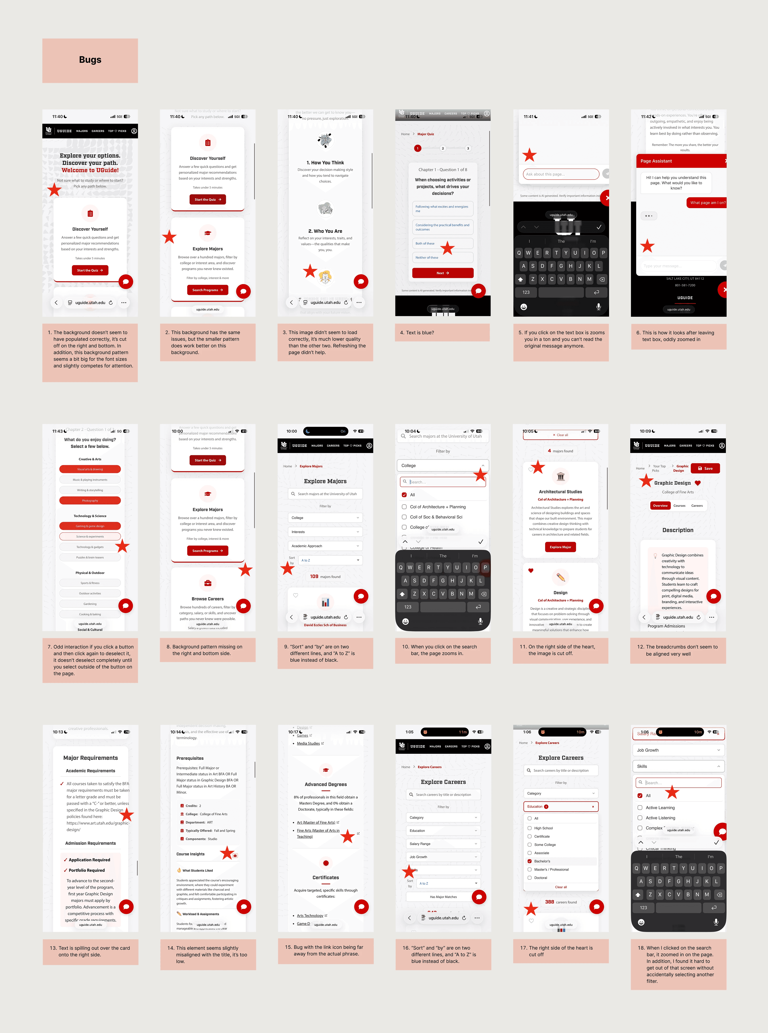
Once I completed my site audit, I began to compile screens that had bugs and errors present. Some of the types of issued found were:
Default, blue text replacing product fonts
Unwanted zooming in when entering text
Low quality or poorly cropped images
Breadcrumb formatting breaking down
Text boxes extending past their card bounds
Icon misalignment
This list of bugs was sent to the developer, who was able to quickly resolve every issue, improving the usability of the site greatly.
Before

After

My next task was completing new UI mockups for areas that needed mobile optimization. I produced 20 total frames, each highlighting the specific areas of change and my reasoning behind them. The developer on our team then used these mockups to implement changes directly into the live product.
The images show the redesign process, featuring a view of UGuide's quiz. The main change here is restructuring the multiple-choice pills below each category. In the original design, pills were stacked vertically. Since this question alone had four categories, users had to scroll significantly just to complete it. My redesign reorganized the pills into a 2x2 grid, cutting the vertical space needed by roughly 40%. The image on the right shows the current live product with this updated layout.
One change from this card ended up affecting the entire site's UI: widening the cards themselves. Nearly every screen had content that was horizontally condensed, leading to longer pages and weaker legibility on text-heavy sections. The wider cards now live across the whole product, giving content room to breathe and creating a more consistent, user-friendly interface site-wide.
The final change on this page was refining the progress bar's colors for better visual cohesion and a more streamlined experience.
Old Page

My Design

Live Page

Working on UGuide taught me how to design within an existing product, balancing new solutions with a system that was already live and being used by real students. Going from mockups to live changes also gave me hands-on experience collaborating directly with a developer, something that shaped how I think about handoff and implementation.
My work on UGuide is ongoing, and I'm excited to see where this product takes me next.
analyzed and annotated
identified and resolved
implemented into the live product